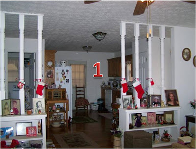
Nevermind that the photo is blurry - there are bigger issues here:
(1) A dog on the sofa. Really? A dog ..... on the sofa? You don't really want to ever advertise that you have pets. You wouldn't believe how many buyers hate dogs/cats inside. Even if your house was spotless and smelled of nothing but roses, the dog hater buyer would swear that there was a strong pet odor and would immeidately storm out of the house. Nothing against dogs on the sofa, I have a rather rotten dog myself and yes, from time to time, he gets on the sofa (but if I were selling my house, he wouldn't be in the photo!).
(2) & (4) go together. Before taking marketing photos, clean your house. Unless you use the "Yellow Pages" as your coffee table book, put it where it belongs. Clean up.
(3) This one took me a minute... look closely at number 3. That's not just random stuff on the shelf, that's dog (or maybe cat) food with a jug of water. Look directly below the shelf and you'll see the food dish. Where do I begin. I'm not saying sellers should kick their pets out of the house when they're trying to sell, but dog food isn't exactly a home decor item! It doesn't belong on the living room shelf. And for crying out loud, go to the kitchen sink for water!
This photo really only shows off the bed and makes it appear that the room is extremely small. A potential buyer may not even notice the room size though, because more than likely, their eyes are going straight to the neon green wall where little Lucy has written all over the wall. It's always a good idea to paint your house with neutral colors when you're marketing it for sale, but it's a darn good idea to at least cover up things like this!
I couldn't possibly number everything wrong with this photo. There's too much "stuff" - it's everywhere! One of the number one rules when staging your home to sell is to remove all of your personal photos throughout. One or two may be okay, but there's just too many here. One of my biggest pet peeves in photos is Christmas decor when it's not Christmas. Really and truly, I bet this is a cute house with the built-in bookshelves, but a buyer looking at homes online would never realize this because they can't see past all of the "stuff." Declutter, get rid of personal photos, clean, take down Christmas decorations, turn on lights when taking photos... etc.
(1), (2) & (3) - Bless #2's heart, he's looking in the wrong direction. This is a great family room - high ceilings, a fireplace and it appears to be open to another room - probably the kitchen. Most buyers can probably look past Rudolph, Comet & Blitzen hanging on the wall, but when it comes to staging a home to sell, dead animals doesn't do too much for the house. Honestly, it wouldn't be so bad in a rec room with a pool table or something, but the family room?
(4) Once again, it's best to remove majority of your family photos. Make it easy for the buyer to imagine themselves living here. Plus, buyers can get distracted looking at your photos, and spend less time looking at your house.
(1) Back to basics - neutral walls, sellers! Neutral may seem boring, but it's what buyers want!
(2) Sellers are often times in a big hurry to get their home on the market and in the MLS system. It's like once they decide to sell, they're ready to do it the next day, no matter what shape their house is in. Take time to clean, organize, touch up paint, landscape, make minor repairs, etc. before you list. This picture does absolutely nothing for the house.
We hope the sellers of the above houses don't contact us anytime soon to list their houses ... we'll have to put them through "seller bootcamp" before we'll even step foot inside their houses with a camera!!


No comments:
Post a Comment